
LEGEND
Life raft for a
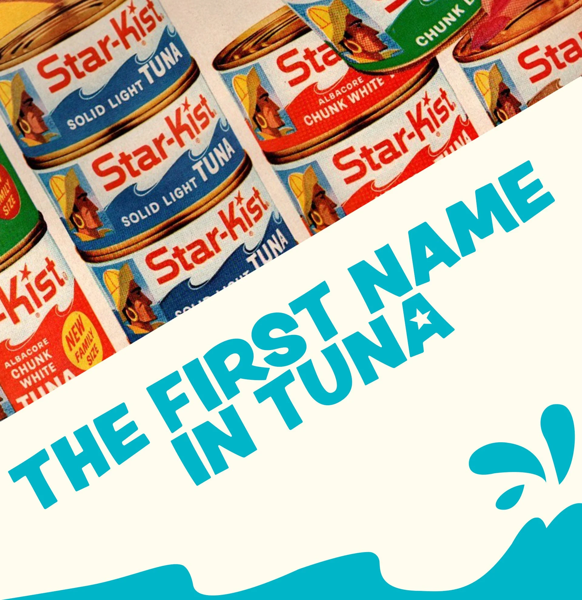
PROBLEM:
Without a clear internal directive, StarKist’s identity fractured, sacrificing its authentic character to chase external trends, resulting in a diluted and inconsistent brand presence.
CHALLENGE
Help StarKist rediscover its heart and create a system that unifies messaging and visual direction across platforms.
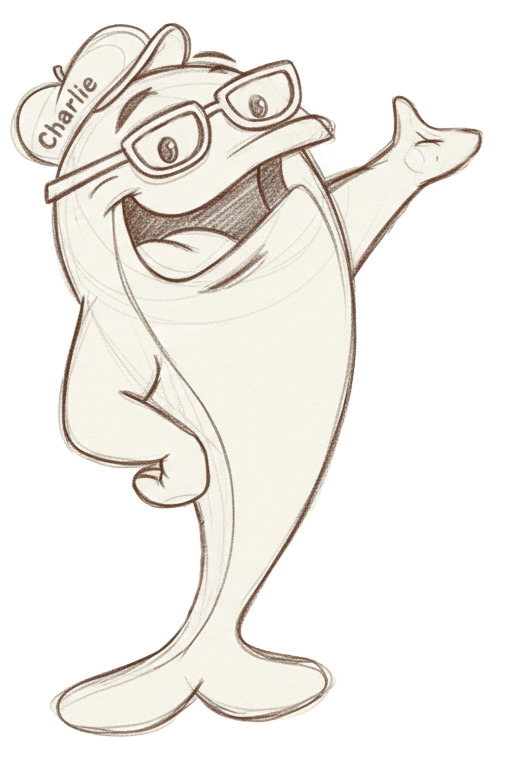
Start with an icon
The team wasn’t quite ready for a full system overhaul, so we met them where they were.
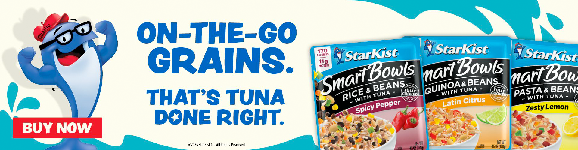
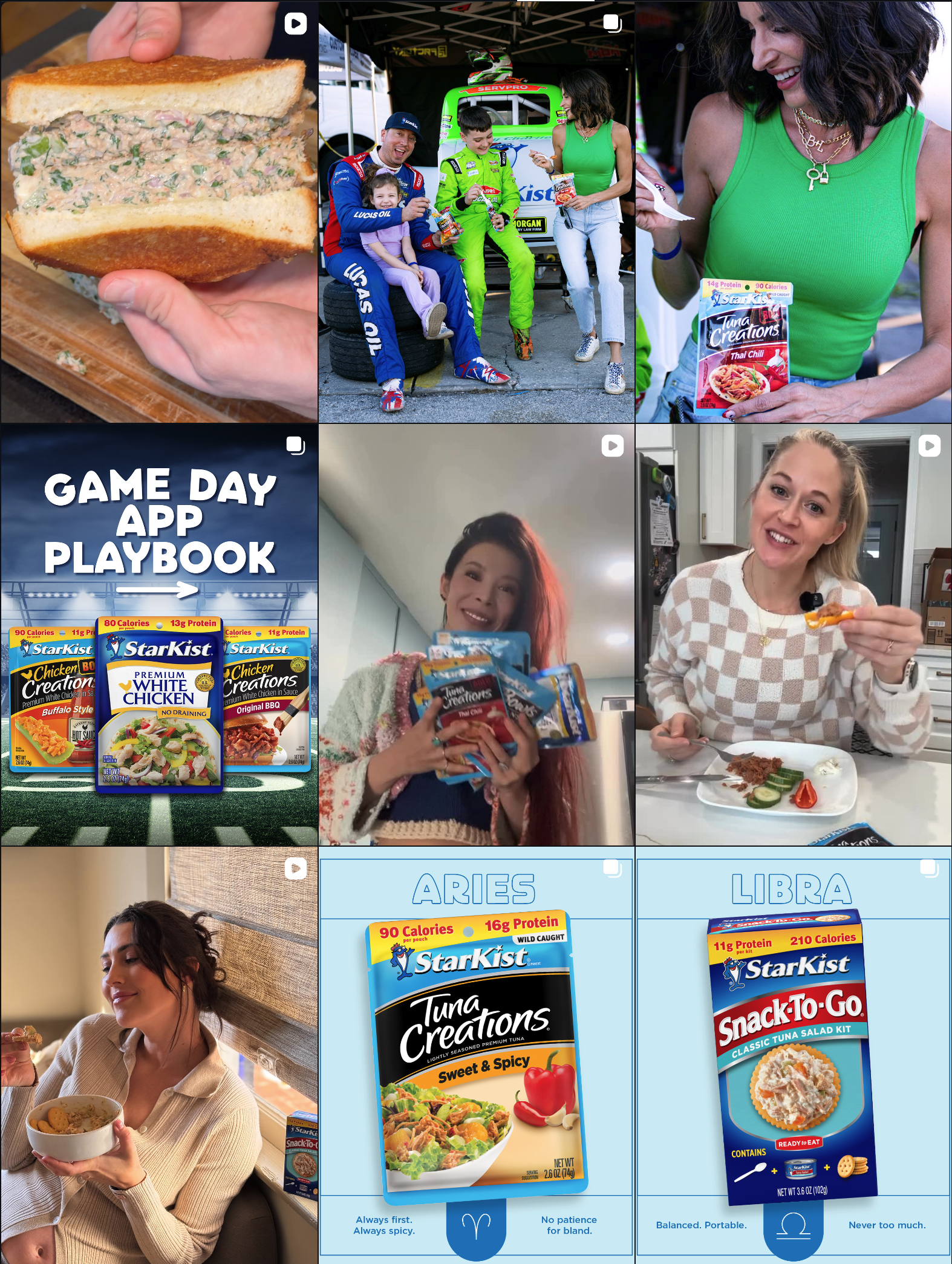
We used a high-visibility campaign to introduce a new look and prove it worked. We brought Charlie back as the witty cultural icon people love, using his personality to anchor the visuals. It allowed us to blend nostalgic cues with a modern layout, keeping the product front
and center.
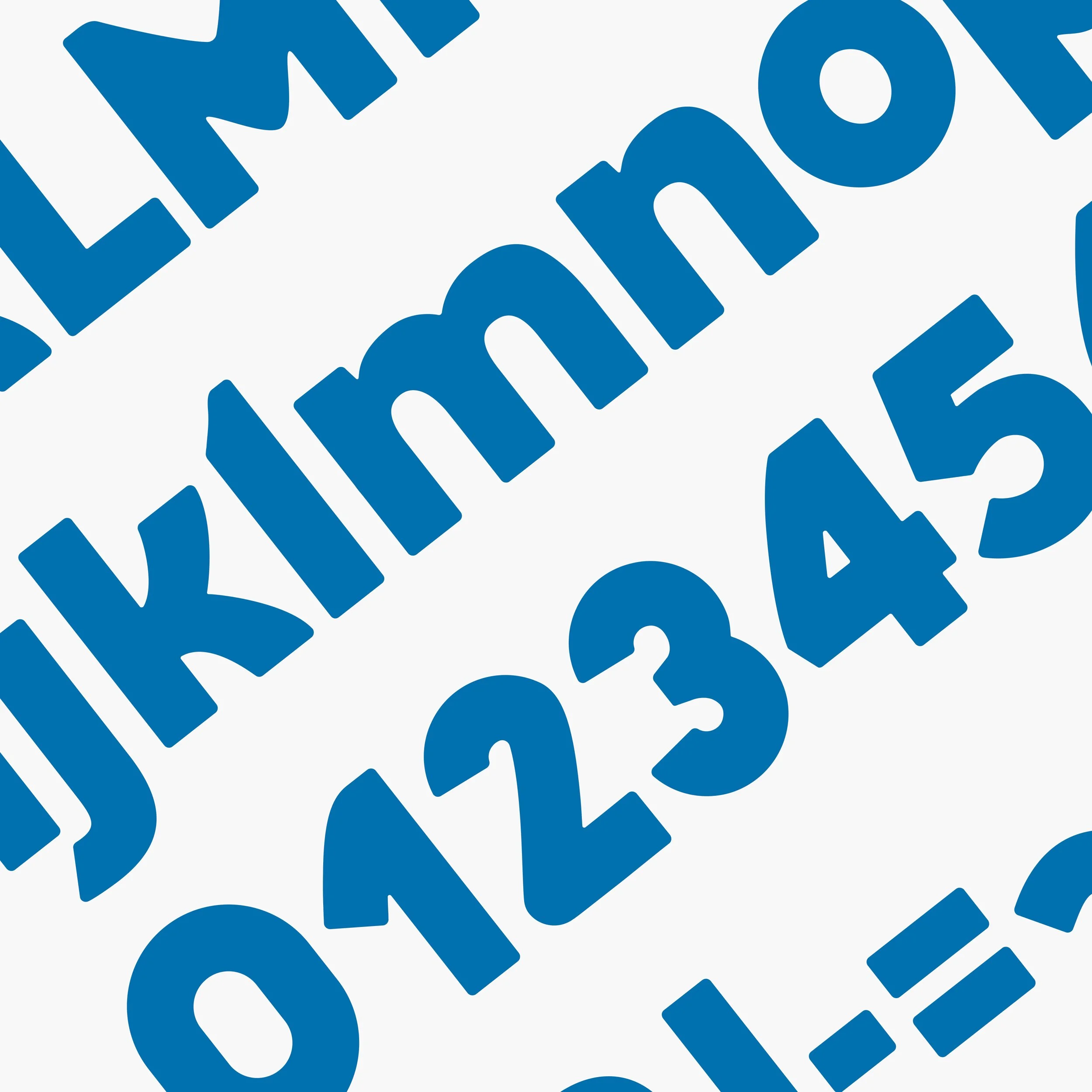
Using legacy branding and a typeface with a little more personality, we added more life and character to the brand.
The campaign’s success
gave us leverage.
Using the campaign typeface as a guide, we designed a custom font that retained the campaign's
character while giving StarKist complete ownership.
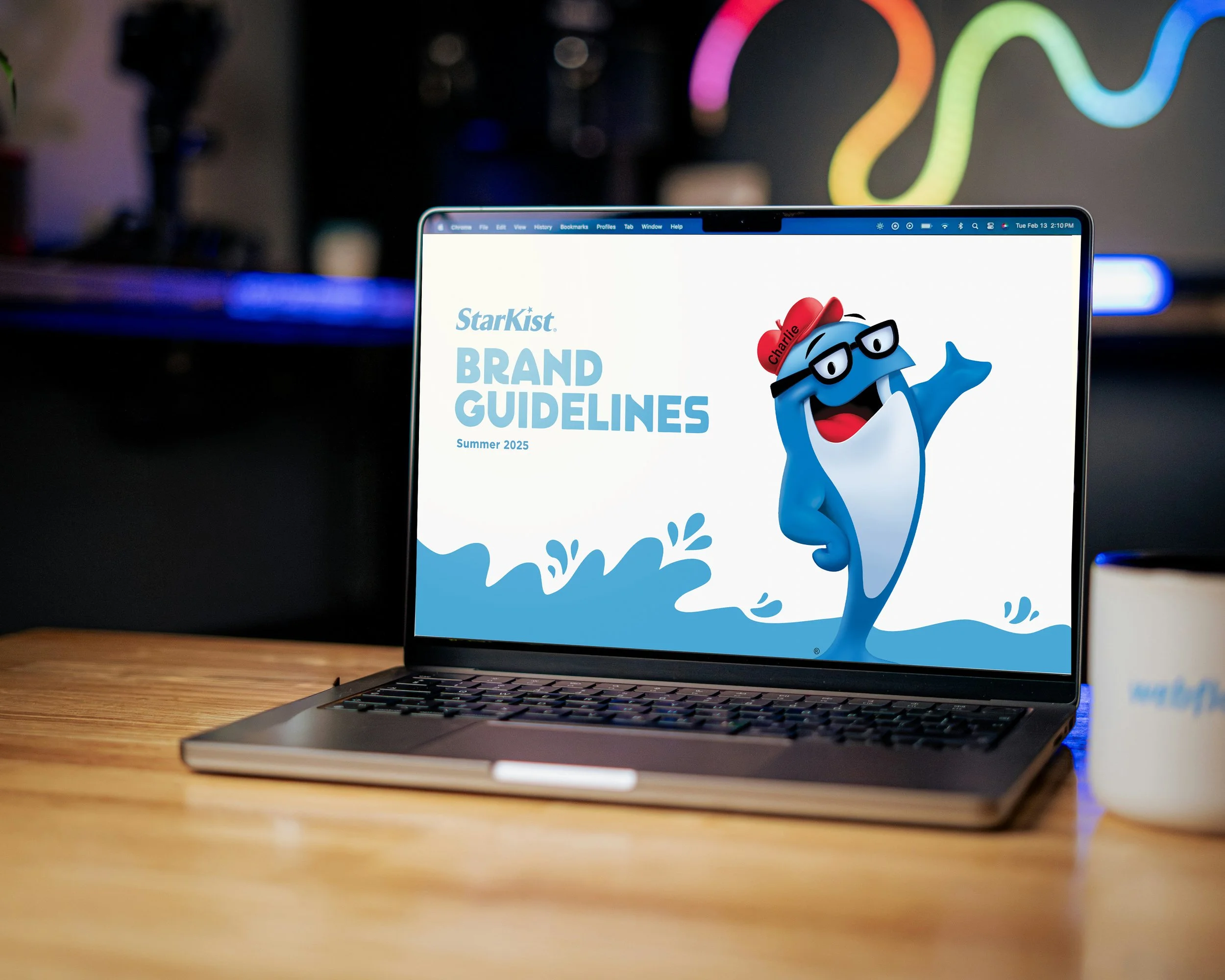
We upgraded their foundation from a loose Word doc to a comprehensive Design System that codified voice, visuals, and character usage into a single source of truth.

Simplified the color palette
Putting it all together.
Modernized a 50-year-old icon to capture audiences while stabilizing the visual system for global consistency.